New Milton Keynes Council logo prompts spot the difference puzzle

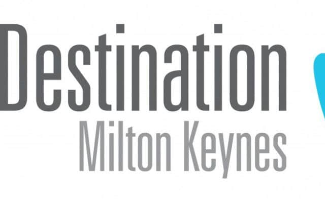
But the new logo will look familiar to most people –because it’s almost identical to that already used by the city’s private tourism company Destination MK.
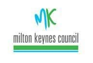
The design, showing a blue M and a green K, was actually jointly dreamed up several years ago by the council and the tourism body.
Advertisement
Advertisement
“It was designed to be a city brand – a logo that everyone would recognise as representing Milton Keynes,” said Destination MK chief executive Steven Gordon-Wilson.
He added: “I am personally quite pleased that the council is adopting it as its own logo.
“I completely acknowledge that it might cause some confusion between us and them at first. But we are both promoting Milton Keynes, so it should not matter at all.”
The new council logo has been approved by all three group leaders, though some councillors have branded it a waste of cash during the current budget crisis.
Advertisement
Advertisement
Leader Pete Marland insisted the only cost was the £660 redesign fee.
He said: “We’re not doing a full re-brand, which would cost much more. Instead we’re planning to use it on stationery and signs as and when they’re due to be replaced.”
Council chief executive Carole Mills said the current logo looked outdated, while the city brand had a more modern font.
“I’m advised that the colours of the MK city brand reflect the blue of our lakes and rivers and the green of our open spaces,” she said.
But Ms Mills warned: “While the city brand is a natural evolution of the MKC logo, ours musty remain distinct so it’s clear who is delivering council services.”